The 2016 Census numbers on homelessness have been out for a week, and you’ve probably seen the news articles swirling around the web.
If you are not a policy boffin, or working in the homelessness sector you can be forgiven for not really knowing what it all means. We have thrown together a helpful explainer, so you don’t have to do the hard work breaking it all down.
House Prices are Closely Linked to Homelessness
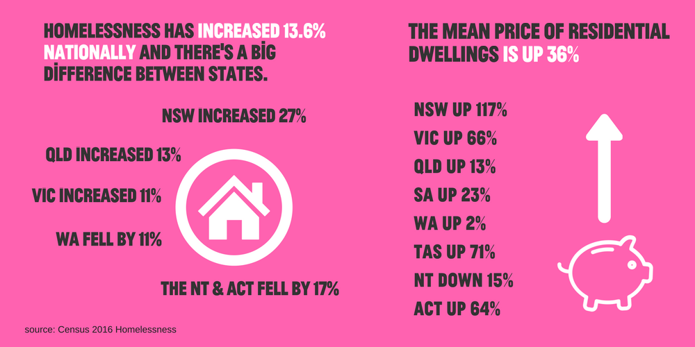 The mean house price is up 36% nationally. But there is a BIG difference between the states. NSW, QLD and Victoria have experienced the biggest price increases and the largest jumps in homelessness. When we dive into the data further, hotspots like Metro Sydney homeless increased by almost 70%. Given that we have no national housing strategy, and a patchwork of state government attempts to address the decades of neglect – these numbers don’t come as a surprise. Hopefully, this will provide a wake-up call for all sides of politics to start taking serious action.
Eroding the Social Safety Net
 One way to understand how the social safety net is failing is to look at groups that are targeted for exclusion. We see clear evidence of this in the homelessness data – which tells us an incredible 46% of all homeless people were born overseas although they only make up 28% of the population. Similarly, Indigenous people make up only 3% of the population and 20% of the homeless population. Young people under 25 make up 25% of all homeless, and this increases to 60% for everyone under 35. All of these groups are regular targets of tough government policies seeking to exclude or limit access to basic public services.
Overcrowding is a big problem
 The biggest proportion of homelessness is people living in ‘severely’ overcrowded dwellings. For the ABS that means there would need to be at least 4 more bedrooms to accommodate the usual residents. WhileIndigenous overcrowding is slowly on the decline (dropping by 5%) – the data tells us that it is still a big problem for the NT. Overcrowding is on the rise elsewhere and is responsible for almost a quarter of the total increase in homelessness. The bulk of that comes from NSW where there is a critical lack of affordable housing.
Not the Whole Picture
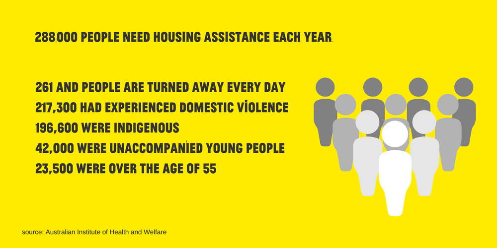 The Census gives us a snapshot of Australia on a given night every 5 years. It is not a perfect system and is generally considered to be an underestimate of homelessness. The Australian Institute of Health and Welfare collate data about people seeking housing assistance and is more up to date than Census figures. This gives us a snapshot of who seeks help and why, but that too doesn’t provide the full picture. New migrants, for example, may not know about how to access services or feel comfortable doing so.
Overall, There Are Few Surprises
Overall, the results of the Census homelessness data are not a surprise to many people in the sector. We know from sources on the ground that the issue is growing across all regions and segments of society.
These figures are an inditement on our federal governments (past and present) which have dolled out concessions to greedy investors while rolling back social support for lower income Australians. This includes policy settings like negative gearing that have turned housing into an investment rather than a basic right. Coupled with a divestment in social housing, this has put a reliance the on the private rental market instead of affordable public housing all while rolling back social support for lower income Australians. In short, it’s a recipe for disaster that hurts the most vulnerable, and benefits only the lucky few.
If you want to do something to change this – you can join the Everybody’s Home Campaign to fight for a better deal. Or join our StreetFunders, and support grassroots projects.